“The time it takes to make a decision increases with the number and complexity of choices.” – William Edmund Hick & Ray Hyman
1. What is Hick’s Law?
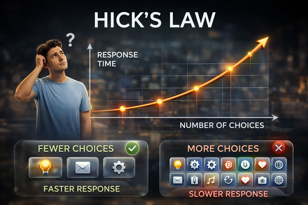
Hick’s Law (also known as the Hick-Hyman Law) suggests that human decision-making is directly impacted by the volume of options presented. When a user is faced with too many choices, the cognitive effort and time required to process them increases logarithmically. This psychological burden leads to decision fatigue. In UX, leveraging this law means strategically simplifying interfaces and restricting options to help users reach their goals faster, thereby reducing bounce rates and accelerating conversion metrics.
2. The Core Concept: Choice Paralysis and Cognitive Load
Choice Paralysis in this context means users feel overwhelmed when presented with an abundance of unfiltered options.
- They abandon a checkout flow if confronted with too many convoluted shipping or payment choices.
- They struggle to navigate a website featuring a dense, unorganized mega-menu.
- They experience a seamless, frictionless journey when choices are logically grouped or stripped down to the absolute essentials.
When you design specifically to minimize this cognitive load, you turn potential overwhelm into rapid decision-making, engineering streamlined paths that directly impact user success and retention.
3. Key Takeaways for UX Designers
- Minimize the Choices: Never overwhelm users with competing actions. Reduce redundant links, visual clutter, and secondary buttons. Keep the primary call-to-action (CTA) distinct, making the correct path obvious.
- Categorize Complex Navigation: Group similar items logically (using methods like card sorting). If a process has many options, categorize them so users can make broad decisions first, narrowing down their focus step-by-step.
- Progressive Disclosure: Don’t show everything at once. Break complex forms or interfaces into digestible, multi-step screens. Revealing information only as the user needs it keeps cognitive load low at any given moment.
4. Real-World Examples
- Search Engines (Google): The classic Google homepage is a pure application of Hick’s Law. By offering just a single search bar and two buttons, it eliminates visual distraction and accelerates the user’s core task, driving immediate interaction.
- Remote Controls (Apple TV): Traditional TV remotes feature dozens of buttons, drastically increasing the time it takes to find the right one. Apple minimized this to a simple directional pad and a few essential buttons, vastly simplifying the choice matrix.
- Food Delivery Apps (UberEats/DoorDash): To combat the paralysis of choosing from hundreds of restaurants, these platforms highlight “Top Picks” or “Previously Ordered” categories. By surfacing curated options, they bypass the infinite scroll and guide the user toward a quicker purchase.
5. How to Handle “Oversimplification” (Interaction Cost)
Because Hick’s Law advocates for reducing choices, there is a fine line between streamlining the user journey and frustrating them by hiding critical features. If a system is simplified by burying essential tools behind too many sub-menus, the cognitive load is merely replaced by a high “interaction cost” (too many clicks). To handle this, balance minimalism with accessibility. Use visual hierarchy to prioritize important elements rather than removing them entirely, ensuring you create clarity, not an obstacle course.
Summary for Designers
“Design for clarity by minimizing choices to accelerate decision-making.” By respecting Hick’s Law, you stop overwhelming users with options and start architecting a frictionless environment that naturally guides them to take action, boosting your usability metrics and overall business impact.