“Don’t make me think. As far as is humanly possible, when I look at a Web page it should be self-evident. Obvious. Self-explanatory.” – Steve Krug
- What is Cognitive Load?
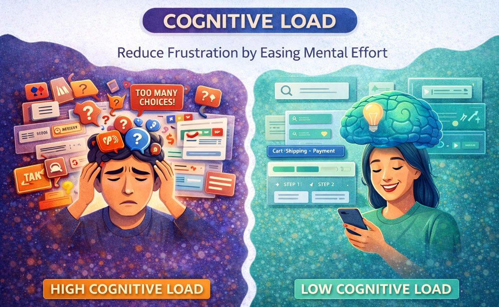
Cognitive Load refers to the amount of mental processing power required to use a site or app. Every time a user has to figure out what a button does, decipher complex jargon, or remember information from a previous screen, their cognitive load increases. If the mental effort required exceeds their brain’s processing capacity, they get frustrated, make mistakes, or abandon the task entirely.
- The Core Concept: Working Memory
The human brain’s working memory is incredibly limited. According to psychology (specifically Miller’s Law), the average person can only hold about 5 to 9 items in their short-term memory at a time.
- If your interface presents too many choices at once (Choice Overload).
- If your navigation is inconsistent.
- If the visual hierarchy is cluttered. You are forcing the user’s working memory to work overtime. Good UX acts as an external memory drive, holding information so the user doesn’t have to.
- Key Takeaways for UX Designers
- Remove the Unnecessary (Extraneous Load): Strip away decorative graphics, redundant links, and jargon that do not help the user complete their immediate goal. White space is your friend.
- Chunk Information: Break long, complex processes (like a 20-field form) into smaller, logical, bite-sized steps.
- Offload Tasks: Let the system do the heavy lifting. Use smart defaults, auto-fill capabilities, and easily accessible help text so the user doesn’t have to rely on their memory or guess.
- Real-World Examples
- Progressive Disclosure: Software like TurboTax doesn’t show you a massive, terrifying tax form. It asks one simple question at a time, hiding the complexity until it is absolutely needed.
- Google’s Homepage: The ultimate example of zero cognitive load. One logo, one search bar. The user knows exactly what to do within a millisecond.
- E-commerce Checkout: Good checkouts show a visual progress bar (e.g., Cart > Shipping > Payment) so users don’t have to keep a mental map of where they are in the process.
- When Should You Increase It?
While you generally want to reduce friction, there are times when you should intentionally increase cognitive load. This is called “Positive Friction.” You should do this during destructive actions (e.g., forcing a user to type “DELETE” to permanently erase an account) or in gamified learning apps where a bit of mental struggle is required to actually learn a new skill.
Summary for Designers
“Your user’s attention is a finite currency; spend it wisely.” By ruthlessly minimizing cognitive load, you create digital experiences that feel effortless, respectful of the user’s time, and ultimately lead to higher task success rates.